
CSS:来扒一扒元素水平垂直居中的实现方法 | 前端高频面试题
扒一扒元素水平垂直居中的实现方法
元素水平居中
我们先来看看如何实现水平居中,我们可以从行内元素、确定宽度的块级元素和宽度未知的块级元素这几点来分析:
对于行内元素,我们可以直接使用文字水平居中 text-align: center; 实现水平居中
对于宽度已知的块级元素 :
⒈版心居中 margin: 0 auto; 实现 => 原理很简单,设置水平方向左右边距auto,会自动居中布局
⒉margin-left实现 margin-left: (父级宽度 - 自己宽度)/2;
原理也很简单,我们可以转化为如下的数学问题:
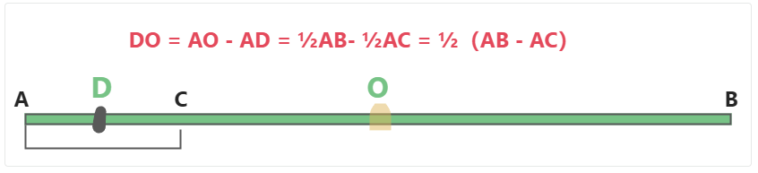
已知AB,AC的长度,O为AB中点,D为AC中点,求DO的长度?(这里的AC可以理解为我们 宽度已知的块级元素,AB为此元素的父级元素,想要实现水平居中,线段上分析即将AC这一长度平移至AB的中间段,也就是D点到O点的距离) → 从图中分析,我们不难看出 水平移动的距离,也就是我们的 父级宽度 减去 自己宽度 后的一半。
⒊绝对定位方式实现 position: absolute; left: (父级宽度 - 自己宽度)/2; 原理同上
⒋……
那么对于宽度未知的块级元素:
⒈table标签配合margin左右auto实现水平居中。使用table标签(或直接将块级元素设值为 display: table),再通过给该标签添加左右margin为auto。
⒉flex布局使用 justify-content:center
⒊……
实现元素水平居中 | |
行内元素 | text-align: center; |
宽度已知的块级元素 |
|
宽度未知的块级元素 |
|
元素垂直居中
我们再来看元素的垂直居中:
利用行高
line-height: 盒子高度;实现文本类垂直居中效果,值设定为要垂直居中盒子的高度弹性布局flex,父级设置
display: flex;子级设置margin: auto;弹性布局flex,父级设置
display: flex; align-items: center;……
⭐ 元素水平垂直居中
现在就很明了了,那么综上所述,元素水平垂直居中的实现方式有:
文字水平垂直居中:text-align: center;line-height: 盒子高度;
div水平垂直居中_Flex布局
父 display: flex; justify-content: center; align-items: center;
父 display: flex; 子 margin: auto;
div水平垂直居中_table布局
父 display: table-cell; vertical-align: middle; text-align: center; 子 display: inline-block; → 块水平垂直居中
父 display: table; text-align: center; 子 display: table-cell; vertical-align: middle; → 块里的多行文字水平垂直居中
div水平垂直居中_绝对定位
绝对定位 + calc 计算偏移量(宽高已知):
子 position: absolute;top: calc((100% - 高度)/2);left: calc((100% - 宽度)/2); 原理类似上文提到的数学问题,这里的100%相当于父级的宽度高度
父 position: relative;(非必需)
绝对定位 + margin负值属性(宽高已知):
子 position: absolute; top: 50%; left: 50%; margin-top: -高度的一半; margin-left: -宽度的一半;
父 position: relative;(非必需,若未设置则相对浏览器窗口而定)
绝对定位 + transform属性:
子 position: absolute; top: 50%; left: 50%; transform: translate(-50%, -50%);
父 position: relative;(非必需)
绝对定位 + margin: auto;属性:
子 position: absolute; top: 0; left: 0; right: 0; bottom: 0; margin: auto; 父 position: relative;(非必需)
原理说明:
当设置绝对定位未设margin: auto时,此时布局定位依旧在左上角,因为虽然定位脱离了文档流但是top的bottom的值是相等的。根据优先级会自动向上对齐。同理左右也是如此。
margin: auto会自动去计算子元素和父元素之间的边距,并设为居中。(margin: auto 默认只计算左右边距,上下auto时默认取0 → margin: auto;和margin: 0 auto;一般情况下无区别,并不能实现垂直居中,当设绝对定位后,margin-top和margin-bottom值不是0了,计算所得后可以实现垂直居中)
具体实现代码如下:
文本水平垂直居中实现
<!-- 文本水平垂直居中 -->
<html>
  <head>
    <meta charset="UTF-8">
	<title>Title</title>
    <style>
      .text {
          width: 200px;
          height: 200px;
          text-align: center;
          line-height: 200px;
          background-color: #6ea8fe;
      }
    </style>
  </head>
  <body>
    <div class="text">文本水平垂直居中</div>
  </body>
</html>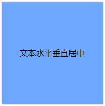
水平垂直居中实现
水平垂直居中_flex布局
<html>
  <head>
    <meta charset="UTF-8">
	<title>Title</title>
    <style>
      .parent {
          width: 800px;
          height: 400px;
          background-color: rgba(0, 0, 0, .2);
          display: flex;
          justify-content: center;
          align-items: center;
      }
      .text {
          width: 200px;
          height: 200px;
          background-color: #6ea8fe;
      }
    </style>
  </head>
  <body>
    <div class="parent">
		<div class="text">水平垂直居中</div>
	</div>
  </body>
</html>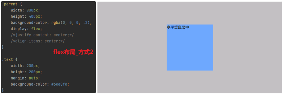
水平垂直居中_table布局
<html>
  <head>
    <meta charset="UTF-8">
	<title>Title</title>
    <style>
      .parent {
          width: 800px;
          height: 400px;
          background-color: rgba(0, 0, 0, .2);
          display: table-cell;
          text-align: center;
          vertical-align: middle;
      }
      .text {
          display: inline-block;
          width: 200px;
          height: 200px;
          background-color: #6ea8fe;
      }
    </style>
  </head>
  <body>
    <div class="parent">
		<div class="text">水平垂直居中</div>
	</div>
  </body>
</html>
<html>
<head>
<meta charset="UTF-8">
<title>Title</title>
<style>
.parent {
width: 800px;
height: 400px;
background-color: rgba(0, 0, 0, .2);
display: table;
text-align: center;
}
.text {
display: table-cell;
vertical-align: middle;
background-color: #6ea8fe;
}
</style>
</head>
<body>
<div class="parent">
<div class="text">党在当代社会指的是以某种政治目的、思想认同而结成有纪律、有组织,并维护该机构或集团的利益的组织。同时,在中国、朝鲜、古巴等国,党特指代表人民的执政党。</div>
</div>
</body>
</html>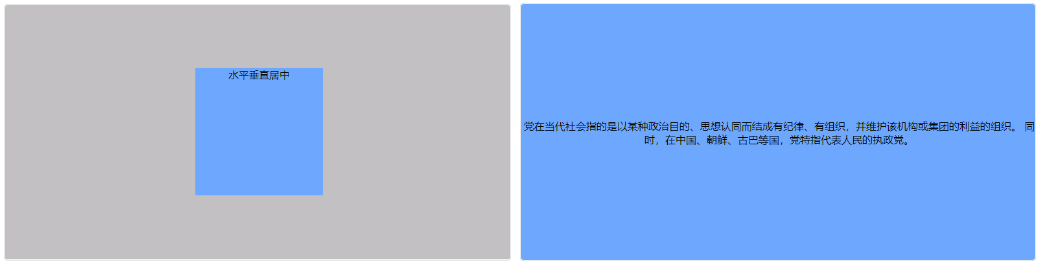
水平垂直居中_定位
<html>
  <head>
    <meta charset="UTF-8">
	<title>Title</title>
    <style>
      .parent {
          position: relative;
          width: 800px;
          height: 400px;
          background-color: rgba(0, 0, 0, .2);
      }
      .text {
          position: absolute;
          top: 50%;
          left: 50%;
          margin-top: -100px;
          margin-left: -100px;
          width: 200px;
          height: 200px;
          background-color: #6ea8fe;
      }
	  /*  绝对定位 + transform */
/*       .text {
          position: absolute;
          top: 50%;
          left: 50%;
          transform: translate(-50%, -50%);
          width: 200px;
          height: 200px;
          background-color: #6ea8fe;
      } */
      /* 绝对定位 + margin: auto */
/*       .text {
          position: absolute;
          left: 0;
          top: 0;
          right: 0;
          bottom: 0;
          margin: auto;
          width: 200px;
          height: 200px;
          background-color: #6ea8fe;
      } */
      /*  绝对定位 + calc计算偏移量 */
/*       .text {
          position: absolute;
          left: calc((100% - 200px) / 2);
          top: calc((100% - 200px) / 2);
          width: 200px;
          height: 200px;
          background-color: #6ea8fe;
      } */
    </style>
  </head>
  <body>
    <div class="parent">
		<div class="text">水平垂直居中</div>
	</div>
  </body>
</html>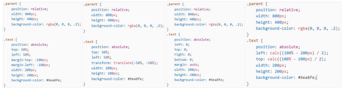

题外话
通过上文我们知道了一些使元素水平垂直居中的实现方式,当然上述仅做示例,它的居中方式也并不局限于以上几种,大家可以开动自己的小脑瓜子想一想~
废话不多说,这里呢,是想拓展一点关于 图片和文字的垂直居中对齐:一般是给高度大的一方(大部分情况下是图片)设置 vertical-align: middle;
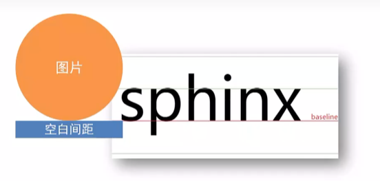
为什么要这么做呢?
是因为浏览器把行内块、行内标签当做文字处理,默认按基线对齐
基线对齐就会产生一些问题:
造成图片文字同行排列不齐,如何使得图片文字垂直居中?
给高度大的一方设置 vertical-align: middle; 一般是给图片设置
图片img底部会有空白,如何消除图片底部留白?
图片转显示模式为块级 不按基线对齐 display: block;
设置其他垂直对齐方式